Seattle_airbnb

So… have you ever wanted to know the relationship between various kinds of information in a large dataset representing the Airbnb rental environment in Seattle?
Of course you haven’t. It is unlikely that you live in Seattle (only 1% of US citizens do, assuming you are within the US). I haven’t even been there.
Nevertheless, you may have used the near-globally popular Airbnb rental service for accomodation. You may even have considered matters from the other end, as a property owner seeking to make best use of an empty room.
If so, such information is highly instructive and likely widely applicable, and could make a very real difference, both on the bottom line and in terms of the comfort and convenience of your lifestyle. There is much we can learn!
These are the three questions I am posing:
1) Do properties with stricter cancellation policies typically have higher prices?
2) How does the number of available properties vary through the year? Is it cyclical? Is there an overall trend?
3) Are there any particular words in the property summaries associated with higher prices?
First, let’s look at whether properties with stricter cancellation properties typically have higher prices. Airbnb has three categories for cancellation: ‘flexible’, ‘moderate’ and ‘strict’.
From the data made available by Airbnb on Kaggle, the answer appears to be yes, there is an association; however, the association is a very weak one, with a Pearson coefficient of 0.26.
What does this mean?
This means that as a renter, if you are seeking a property with a higher price, it won’t necessarily require you to follow a strict cancellation policy, although it is more likely to. As a landlord, it means that even if you have a property that doesn’t fetch a high price, you can still set strict cancellation policies without being completely out-of-step with rival properties.
Next, I took at look at the data describing the number of properties available to rent out of the total, and how this varied through the data. The graph describing this data is shown below.
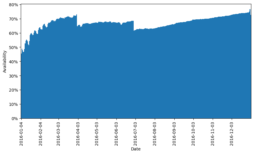
Here we can see a number of very interesting features:
i) The availability of properties increases throughout the year - perhaps due to more people learning about and deciding to use the Airbnb service for their property, and supply rising faster than demand.
ii) There is a cyclical variation in property availability with a wavelength of one week. This diminishes towards the end of the year - perhaps linked to point (i).
iii) There are two big drops in availability. This may be due to major events in the Seattle area or perhaps set times in the academic year.
While the data is from 2016 and is particular to Seattle, I believe this is highly applicable to any time and location. Be aware of the competitive environment for airbnb properties (low availability is good for the would-be landlord and bad for the would-be renter, and vice versa), be aware of the days in the week that are most in demand and be aware of any major local events that could temporarily drive up demand.
Finally, I looked at which words in the summaries appeared linked to high rental prices. The ten words most associated with high prices are shown below:
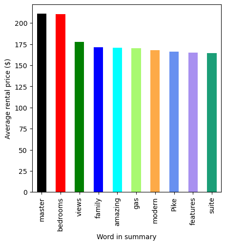
This is fascinating. Note that renters are seemingly most willing to pay top money for:
great views
multiple bedrooms
popular locations (Pike Place is home to a famous market)
modern fittings
…among other things.
Surely of interest to anyone seeking to maximize the returns from a potential rental property!